Casual observation suggests the risk-on bias of late has no limits. US stocks, for instance, after a sharp correction last week, are rebounding anew. Par for the course.
Bullish trends, however, aren’t universal. How would you know? The list of metrics to monitor in search of insight could fill a warehouse. In the interest of brevity, consider how the ratio of the 50-day/200-day moving averages compares across a broad set of markets. Specifically, let’s review our standard 16-fund opportunity set than spans the world and aggregate to the Global Beta 16 Index (G.B16). See this summary for a list of funds.
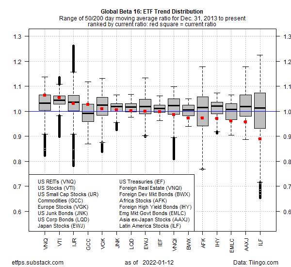
The chart below profiles how these 16 ETFs stack up for the 50-day/200-day ratio through today’s close (Jan. 12). For each ticker, the chart shows the historical range of the ratio since Dec. 31, 2013 through the present. The goal is to provide some perspective on how a given market is trending, in absolute and relative terms.
The chart presents trending behavior on several dimensions. Here’s how to interpret the data. First, note the horizontal blue line, which marks 1.0 — a neutral level, i.e., the 50-day average exactly matches the 200-day average. The higher a value is above (below) 1.0, the greater the degree of bullish (bearish) trending behavior. A 1.1 ratio, for example, indicates that the 50-day average is 10% above the 200-day average — a bullish posture.
The red squares indicate the latest ratio while the gray boxes show the interquartile range — 25% to 75% quantiles, or the range of values that’s “likely” to prevail (based on the historical window). The median value is shown by the horizontal black bar within the boxes. The outliers (relatively extreme values) are shown extending above and below the boxes.
One way to interpret the results is to look for extreme values on three fronts. First, is the red dot above or below the median ratio? Second, is the red dot above or below the neutral blue line? Next, is the red dot outside the box?
For example, the current ratio for the iShares Latin America 40 ETF (ILF) is 0.89, which is well below 1.0, the median and below the box — a three-time loser. In other words, the current trend for ILF is quite weak, not only in relative terms vs. the ETF’s history, but also when compared against the other markets in the chart above.
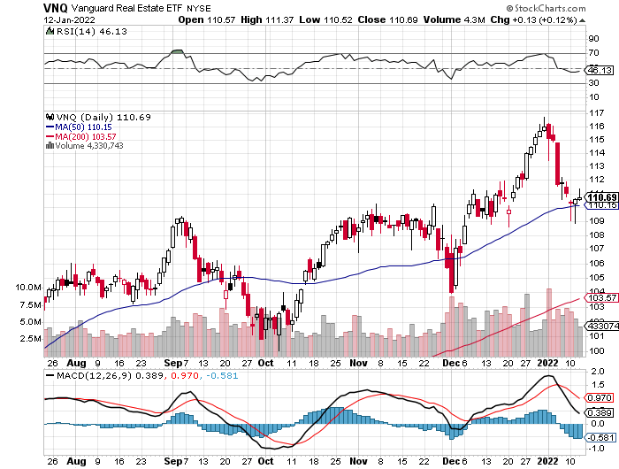
At the opposite extreme: US REITs (VNQ), although the degree of bullish trending behavior isn’t quite as dramatic as the depth of the bearish trend for ILF.
As usual with trends, the possibility of mean reversion comes into play when the numbers are relatively extreme. Caveat emptor, of course. But in relative terms, ILF and VNQ look like good candidates for a change in direction relative to the recent trending behavior.
On that note, let’s close with charts of ILF and VNQ in recent history:


